Flawless Experiences on Every Device
With over 60% of web traffic coming from smartphones, mobile optimization isn't optional. Build pages that automatically adapt and look perfect on any screen size.
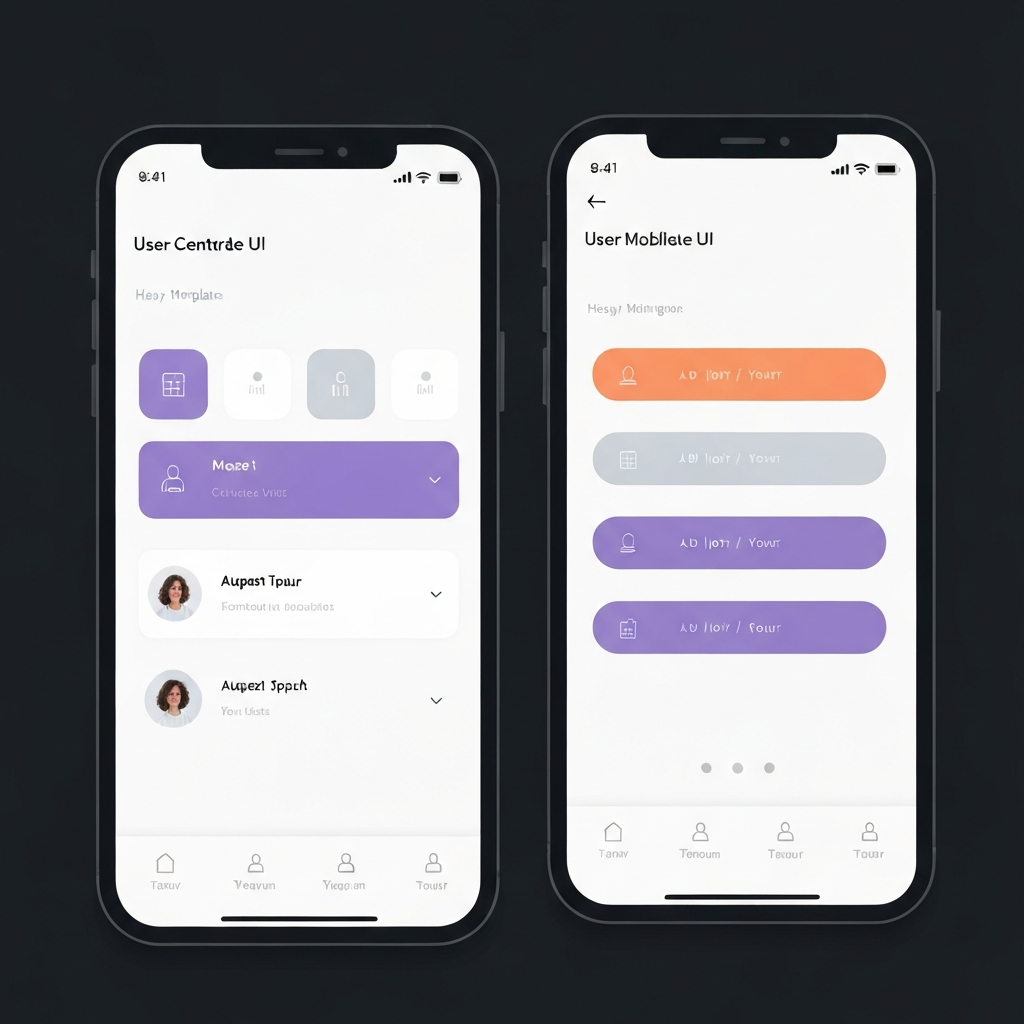
Don't Lose Half Your Traffic
You spend time and money driving traffic to your landing pages. But if those pages look broken, require side-scrolling, or have tiny, unreadable text on a mobile phone, that traffic will bounce instantly. A poor mobile experience destroys trust and plummets conversion rates.
Traditionally, ensuring a page looked good on mobile meant writing complex CSS media queries or maintaining two entirely separate versions of a website—one for desktop and one for mobile. This doubled the workload for every change.
Bring On The Leads handles mobile responsiveness automatically, with powerful manual overrides when you need them.
Responsive by Default
When you build a page in our editor, the underlying grid system automatically stacks columns, resizes images, and adjusts padding for smaller screens. A three-column feature section on desktop gracefully becomes a single-column scroll on a smartphone without you doing a thing.
This ensures that no matter what device your prospect is using—a massive desktop monitor, a tablet, or an older smartphone—your brand looks polished, professional, and is easy to interact with.
Total Control Over Every Breakpoint
Automatic responsiveness is great, but sometimes you need fine-grained control to create the perfect mobile experience.
Device-Specific Visibility
Want to show a large background video on desktop but a static image on mobile to save bandwidth? Easily toggle the visibility of any section, row, or element based on the device viewing it.
Mobile Live Preview
Switch between Desktop, Tablet, and Mobile views directly inside the editor. See exactly how your page will render on a phone while you're building it, ensuring no surprises after you publish.
Mobile-Optimized Typography
Set different font sizes, line heights, and margins specifically for mobile devices. Ensure your headlines are punchy on desktop but don't take up the entire screen on a smartphone.
Why Mobile Matters by Industry
Home Services
When a homeowner has a burst pipe or a broken AC, they don't go to a desktop computer; they pull out their phone. Mobile-optimized pages with sticky "Click to Call" buttons are critical for capturing emergency service leads instantly.
See Home Service SolutionsFitness & Gyms
Fitness consumers are highly mobile. They browse social media on their phones, click on gym ads, and expect to be able to book a session or view the class schedule seamlessly without pinching and zooming.
See Fitness SolutionsReal Estate
Buyers often search for homes while driving through neighborhoods. Real estate landing pages must load fast on cellular networks and display property photos beautifully on high-resolution mobile screens to capture interest.
See Real Estate SolutionsMarketing Agencies
Agencies running Facebook and Instagram ads know that 90%+ of that traffic is mobile. Providing clients with landing pages that convert mobile traffic effectively is the key to delivering a positive ROAS.
See Agency SolutionsStop losing mobile leads.
Build beautiful, responsive pages that convert traffic into customers, no matter what device they use.
Book a Demo